Another card for the Online Classes.
This one uses Distress Inks and salt. Love the patterns that develop when the two mix and I think this colour combo is so pretty.
I think that color combo is very pretty too! For some reason, I cannot get my inked panel to look right when I use the salt but yours turned out beautifully! Love it, Sue! :)
Oh, girl, do I love these colors together! What a beauty this card is and thank you very much for moving these distress inks up my wishlist....I think. LOVE this!
I have not tried this technique yet - but hopefully this weekend. Your card is so beautiful --- I love the colour combination you chose. It is set so perfectly against the white card base.
Sue, not only are these colors beautiful, but you knocked this technique right out of the ballpark. Just gorgeous. You spotlight today is so well deserved!!
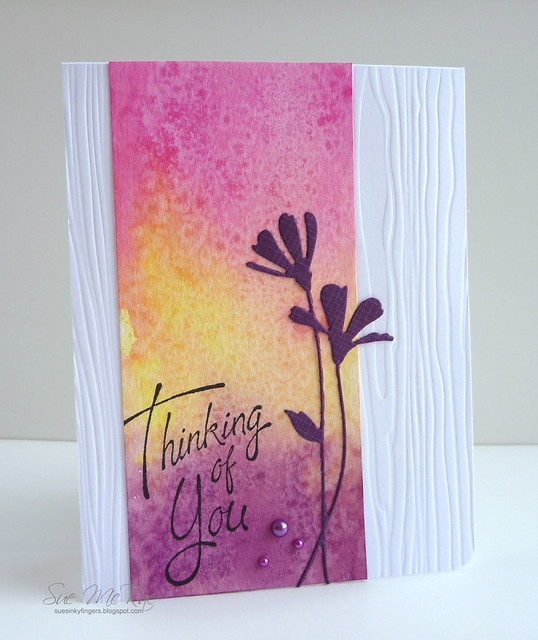


Beautiful. Great colour combo - great texture with the salt pattern yet it is still CAS.
ReplyDeleteWow, the salt effect is lovely! Must must try that! Thanks for sharing, Sue!
ReplyDeleteOh wow Sue, this is absolutely stunning! Love the colours and effect you've achieved with the salt on the main panel! The embossed bg is gorgeous too!
ReplyDeleteSue, your card is beautiful. The color combination is wonderful and the salt technique came out so well! Thanks!
ReplyDeleteBeautiful! This technique has been around a long time and I love the results every single time.
ReplyDeleteWow!! That's crazy gorgeous!
ReplyDeleteI think that color combo is very pretty too! For some reason, I cannot get my inked panel to look right when I use the salt but yours turned out beautifully! Love it, Sue! :)
ReplyDeleteLove your color combo, Sue! I haven't had a chance to try this, but tomorrow is the day!! Gorgeous card.
ReplyDeleteThis is a gorgeous color combo! I love how you used the die cut in your design!
ReplyDeleteHi Sue, Beautiful card--love your color combos. The die cut flower is wonderful.
ReplyDeleteOh, girl, do I love these colors together! What a beauty this card is and thank you very much for moving these distress inks up my wishlist....I think. LOVE this!
ReplyDeleteGreat colors Sue! So pretty.
ReplyDeleteThis is beautiful! Love the colors.
ReplyDeleteYup, stunning. Love this so much! Congrats on being highlighted in class!
ReplyDeleteI have not tried this technique yet - but hopefully this weekend. Your card is so beautiful --- I love the colour combination you chose. It is set so perfectly against the white card base.
ReplyDeleteSo glad the teachers spotlighted this card!! Congratulations!!
ReplyDeleteJust gorgeous, Sue! Love the color combo you chose!
ReplyDeleteThis is such a beauty...Congrats on being featured in today's class!
ReplyDeleteI agree! A delicious colour combo and a wonderful card!
ReplyDeleteThis turned out great!!! Beautiful colors and design!
ReplyDeleteWhat a gorgeous card and the colors! Oh my! Greeat job!
ReplyDeleteGorgeous color and texture.
ReplyDeleteSue, not only are these colors beautiful, but you knocked this technique right out of the ballpark. Just gorgeous. You spotlight today is so well deserved!!
ReplyDeleteReally gorgeous card. I like the sentiment a lot -- where is that from? Love the Tim Holtz seasonal ink colors, they are so vibrant.
ReplyDeleteSuch a beautiful card!
ReplyDeleteOh Sue this is gorgeous!
ReplyDeleteSue, this is absolutely gorgeous! Love the colors - they turned out so vibrant!
ReplyDeleteWow...what a beautiful card!
ReplyDeleteGorgeous!
ReplyDeleteWOW! This card is just gorgeous - thanks so much!
ReplyDeleteGORGEOUS,!!
ReplyDelete